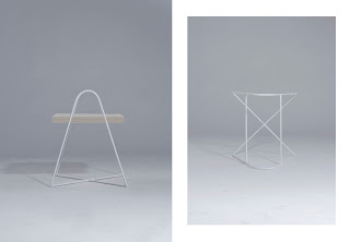
Arjen Roos
dinsdag 9 oktober 2012
_UNTITLED
_UNTITLED is a collaboration between Vivian van Miert, Chinouk de Miranda and me. We created a magazine that is presented as an object. The concept of _UNTITLED revolves around reinterpreting each others style, to create a new perspective on fashion. This is visualized in three photoshoots, where we decided on photography, styling, setting, models, etc all together. Every shoot starts with 'I AM ... UNTITLED' and finishes with 'UNTITLED ... BECAUSE', where we first give a description of our style and finish with an explanation of the value of doing all the connecting and direction together (Lifestyle&Design). The three photoshoots are presented in three white booklets with a semitransparent paper cover, which are attached to each other through a string in the back. When you see it from the top, it looks like the tripod sign as used in our logo.
woensdag 1 augustus 2012
Shirt with wooden details
This shirt has details of wood veneer. No worries about washing it, all the wooden details can be removed from the shirt, as I created 'tubes', with openings on the inside. So it is also possible to add another material, as long as it is a little flexible if you still want to move comfy in it.
Canopy Design
The first design of the canopy I made was like above. Straight wooden panels in the corners, white branches on top. For the second design I decided to go on with this canopy and make it more special.
The wooden panels are replaced by panels with a place for clothing, a nightstand and a fitting mirror, decorated and strenghtened by copper details. These panels will be able to slide back and forth in one direction.
Also the white branches on top are decorated with copper wire. And here you see where the panel components can move. There is room for three panels, as the head of the bed is fixed and as wide as the bed itself.
donderdag 5 april 2012
Fashion | Furniture

This is my Fashion & Interior collection I made last semester (September to January). I haven't made pictures yet, but these are the sketches. There are three outfits and three furniture pieces. The first coat is combined with a lamp, the second outfit exists of a coat and a short top and it is combined with a vase, and the third shirt is combined with a box. I've made the fashion items fit with the interior pieces through colour, shape and fabric, but mostly through the details of zippers, invisible buttons and pattern.
Edit: A preview of one of the outfits, photographed by Tim Verhallen:
donderdag 1 december 2011
Fashion Film
maandag 15 augustus 2011
Project COS I
Man You Facture

Cover for 'Man You Facture' magazine
Shoes: in property of Ansh46 by Rosanne Bergsma
Table: Maurice Leeflang
Photography & Styling: Arjen Roos
Androgyn


Covers for 'Androgyn' Magazine - January 2011
Model: Eliska Cnossen
Photography & Styling: Arjen Roos
Abonneren op:
Reacties (Atom)


